Did you know around 14% of the American workforce lives with a disability, and 27% of the population overall has a disability?
At Kingland, we create software for thousands of users who spend hours a day using our systems. That includes people with disabilities, who are valuable assets in any organization. They contribute diverse perspectives and deliver excellent work. And they deserve a workplace that helps them reach their full potential. So our responsibility - and the right thing to do - is to build accessible applications.
Accessibility is also the law.
The Americans with Disabilities Act requires that both "public" websites and work environments are accessible for users with disabilities. Domino's Pizza found this out the hard way in 2019 and a blind employee successfully sued a school district over internal software in 2019. So those who aren't thinking about accessibility for their solutions should be.
Is your team considering accessibility as you design and implement features? How can we know for sure whether software is accessible? First, let's look at a scenario for a software team.
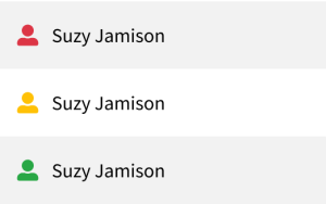
Imagine that your solution is adding a table that lists all users in the system. Your admins need to know whether users have recently logged in and completed a task. A common way to show information like this is to add an icon, so the first draft of the table design includes 3 versions of the 'user' icon to indicate whether the task is overdue, due soon, or up to date:

Can you guess which icon is which?
And how about now?

This is what people with various types of color blindness would see.
What if someone read the information aloud to you like this?
"Main landmark frame table with 3 rows and 2 columns. Row 1 Column 1. Column 2 Suzy Jamison. Row 2 Column 1. Column 2 Suzy Jamison. Row 3 Column 1. Column 2 Suzy Jamison. Out of frame, out of table."
Did you notice that the icons aren't even mentioned? (Transcript from a popular screen reader, NVDA.)
The problem with this icon design is that it's not accessible for users who are color blind or use a screen reader. It would be frustrating to use - and could even prevent someone from doing their job. A few adjustments can improve the design for these users. But how do we know what should change?
The Web Content Accessibility Guidelines (WCAG) are the gold standard for creating accessible web experiences. WCAG has several requirements that apply to our table design:
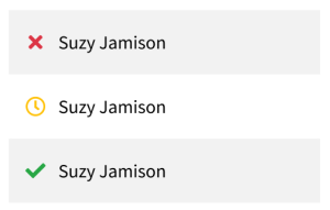
Let's try again. First, let's fix the icons themselves so that they communicate meaning, regardless of color.

And ...

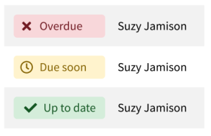
Next, we need to think about text alternatives. It's not really clear that "❌" means "Overdue." It could also mean "Deleted" or even "Click here to remove this row." One option is to create a tag element with text next to the icon:

Here are a few ways you and your company can contribute to accessibility during your planned projects:
Look for more tips like these in the future. Thanks for reading and let me know how Kingland can help.
These Stories on Kingland Culture


No Comments Yet
Let us know what you think